Categories
Archives
- July 2024
- June 2024
- May 2024
- March 2024
- January 2024
- December 2023
- October 2023
- September 2023
- August 2023
- July 2023
- May 2023
- April 2023
- January 2023
- December 2022
- October 2022
- September 2022
- July 2022
- June 2022
- April 2022
- March 2022
- December 2021
- November 2021
- September 2021
- July 2021
- May 2021
- March 2021
- January 2021
Table
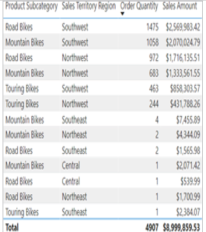
A table is a grid that contains data that is ordered in rows and columns. Tables work well with quantitative comparisons where you are evaluating many values for a single category. Technologies such as Power BI Paginated Reports and SSRS format large tables to fit onto multiple pages make them easier to read. This type of reporting is known as paginated and has been used in BI solutions for decades. Figure 1.18 is an example of a table that lists the quantity sold and total sales amount for different bike subcategories sold online in different US regions.

FIGURE 1.18 Table
Matrix
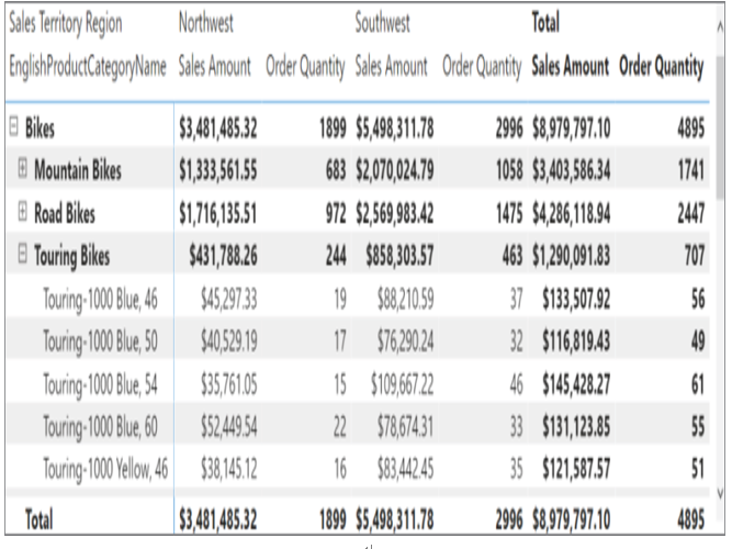
A matrix is a table that summarizes data into totals and subtotals for different groupings. In Figure 1.18 we can see that most bikes that are sold online in the United States are sold in the Northwest and Southwest sales territory regions. However, tables can become very hard to read if we start adding additional levels of granularity such as sales data for specific types of bikes. Matrices take care of this issue by providing a hierarchical structure that provides totals for multiple layers of granularity. Figure 1.19 is an example of a matrix that displays order quantity and sales totals for bikes, each bike subcategory, and each specific bike type sold online in the US Northwest and Southwest regions.

FIGURE 1.19 Matrix
Column and Bar Charts
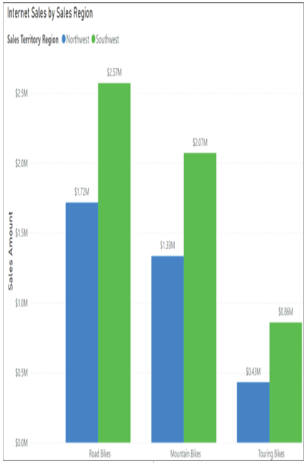
Bar and column charts enable organizations to see how a set of variables change across different categories. Both chart types represent data with rectangular bars. The difference between the two is that if the rectangles are stacked horizontally, it is called a bar chart, and when they are aligned vertically, then it is a column chart. Figure 1.20 illustrates an example of a column chart that compares the total Internet sales amount for the different subcategories of bikes sold in the US Northwest and Southwest sales territories.

FIGURE 1.20 Column chart


Leave a Reply