Categories
Archives
- July 2024
- June 2024
- May 2024
- March 2024
- January 2024
- December 2023
- October 2023
- September 2023
- August 2023
- July 2023
- May 2023
- April 2023
- January 2023
- December 2022
- October 2022
- September 2022
- July 2022
- June 2022
- April 2022
- March 2022
- December 2021
- November 2021
- September 2021
- July 2021
- May 2021
- March 2021
- January 2021
Line Chart
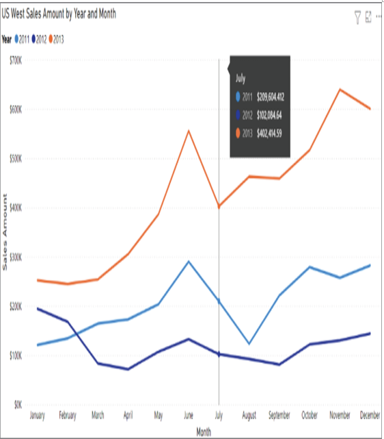
Line charts represent how a series of values change over time. Power BI enhances line charts by including a tooltip that provides more granular information for each data point on the x-axis. This is helpful if you are trying to prove a correlation between data points. Tooltips can be displayed by hovering your mouse over the x-axis value you would like to further analyze. Figure 1.21 illustrates an example of a line chart that compares monthly Internet bike sales in 2011, 2012, and 2013 in the US West sales territory. This line chart also includes a tooltip displaying the Internet sales totals for the month of July in each year.

FIGURE 1.21 Line chart
Pie Chart
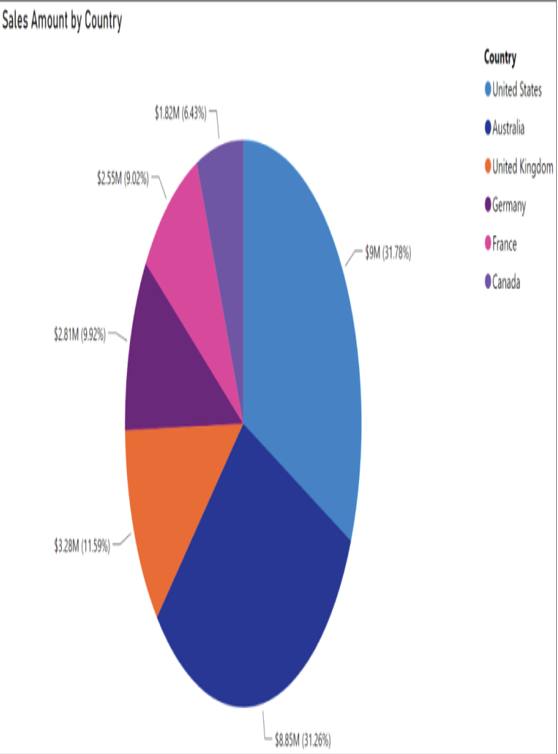
Pie charts are useful for determining how responsible different categories are for a given value. Each category corresponds to a single slice of the pie, and the size of each slice indicates the percentage of the whole pie each category is responsible for. Figure 1.22 illustrates an example of a pie chart that displays the total Internet bike sales for each country where a sale occurred as well as the percentage of the total sales that each country is responsible for.

FIGURE 1.22 Pie chart
Scatter Plot
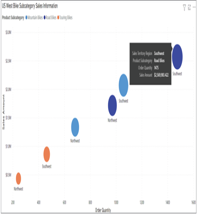
Scatter plots show the relationship between two numerical values. Power BI enhances scatter plots by including a tooltip that provides more granular information for each data point, or bubble. Tooltips can be displayed by hovering your mouse over the bubble you would like to further analyze. Figure 1.23 illustrates a simple example of a scatter plot chart that displays the correlation between the sales amount and order quantity for the different types of bikes sold online. The plot takes the analysis a step further by examining this correlation for the US Northwest and Southwest regions.

FIGURE 1.23 Scatter plot
Map
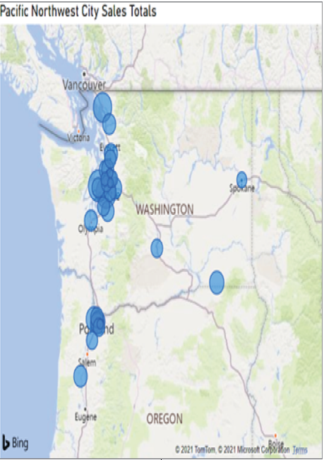
Maps show the geographic distribution of data. These visualizations can show broad comparisons such as country or state sales information or very granular comparisons at the postal code, address, or latitude and longitude level. Figure 1.24 illustrates a map that displays cities in the US Pacific Northwest where bikes were bought online. The size of the bubble represents the total bike sales proportion that each city is responsible for.

FIGURE 1.24 Map


Leave a Reply